Checkout & Conversion Flow Optimisation for an Online Accessories Store
We rebuilt the entire checkout flow, added one-tap payments, improved mobile UX, and streamlined the purchase path — resulting in a 31% conversion increase, an 18% boost in AOV, and 19% of all new orders coming through Apple Pay.
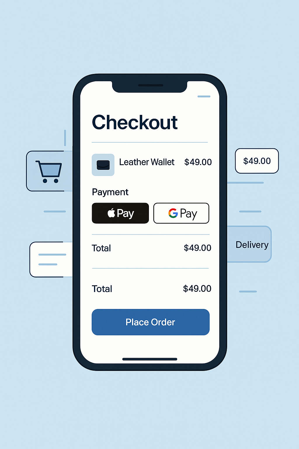
How we rebuilt the entire purchase experience, removed friction, and increased conversions through a streamlined checkout flow
When Oliver Scott, the owner of a mid-size online accessories store, reached out to us, he was struggling with a familiar problem: the store had solid traffic but disappointing purchase completion rates. Customers were browsing, adding products to their carts, and then dropping off right before the finish line. On our initial consultation, we analysed the business metrics and discovered the core issue — the checkout process was slow, outdated, and too complicated for modern shoppers.
The store relied on a multi-step checkout that required visitors to repeatedly input details, navigate through cluttered forms, and wait for scripts to load. On mobile, the experience was even worse: buttons shifted, the layout broke on some screen sizes, and payment options were limited. More than 72% of the site’s visitors came from mobile devices, yet the checkout had never been optimized for a mobile-first experience. No Apple Pay, no Google Pay, no visual reassurances — just friction at every step.
We began by conducting a full behavioural analysis using Hotjar recordings, Google Analytics funnels, and session heatmaps. This allowed us to pinpoint exactly where users dropped off and what caused hesitation. The findings were clear: long loading times, too many input fields, poor mobile UX, and a lack of trust markers were the primary blockers preventing sales.
Our first step was redesigning the entire checkout flow with a “frictionless path to payment” approach. We reduced the number of required actions, simplified forms, improved button hierarchy, and restructured the mobile layout to ensure effortless navigation. To further streamline the experience, we implemented one-tap payment options such as Apple Pay, Google Pay, and Shop Pay — drastically reducing buying time for returning and mobile customers.
At the same time, we focused on increasing the average order value. We introduced lightweight upsell modules on the product page, in the cart, and right before the checkout, featuring complementary items with dynamic recommendations. To strengthen customer trust, we added clear information blocks about delivery times, returns, guarantees, and secure payments — elements that significantly reduce last-minute abandonment.
After completing the redesign, optimisation, and testing, we launched the new checkout system. The results appeared almost instantly. The checkout loading time was reduced by nearly 50%, and abandonment rates dropped dramatically. Within the first three weeks, the store saw a 31% increase in conversion rate, and the average order value increased by 18% thanks to strategically placed upsells. The addition of Apple Pay alone contributed to 19% of all new orders within the first month — making it clear how much customers preferred fast, one-tap payments.
Today, the store has a checkout experience built for how real customers behave: fast, simple, mobile-first, and trust-driven. By removing friction and implementing modern payment technology, we turned an underperforming funnel into one of the strongest revenue drivers for the brand.
Key Metrics After Checkout Optimisation
- 3 weeks — full audit, redesign, and implementation
- +31% increase in checkout conversion
- +18% increase in average order value
- –41% checkout abandonment rate
- 19% of orders via Apple Pay in the first month
- 2× faster checkout loading time
- Significant increase in repeat purchases due to improved experience

